Cursor Pack
- Download Info
-


- Author(s): Pillbug
- Categories: Miscellaneous, Graphics
- Downloads: 128
- Main
- Reviews
- Versions
- Screenshots
- File Discussion
- Contribute
- Add a Screenshot
- Write a Review
Description
Well, this isn't a very good pack. Useless, really. But, here it is. A bad cursor package to use in the main game. Yep.
| Released: | October 4th, 2007 |
|---|---|
| File Size: | 38.67 KB |
| Downloads: | 128 |
| Release Notes: | Initial version. |
 | |


This pack sucks. Period. The 'cursors' are just poorly drawn pictures.
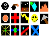
The first picture, is supposedly an 8-ball. You know, the black ball you sink last in a game of pool? Well, it doesn't look very good at all. Besides, why would you want a ball as a cursor. A cursor isn't supposed to be circular. It's supposed to have a certain position (generally the top-left corner) which does all the pointing, selecting etc. If your cursor is a circle, it's really hard to tell where the pointer bit is.
The second is a bomb. Like the previous one, it has a circular shape. The stringy bit (the bit where the fire goes down - I forgot what it's called) looks like crap. it's brown, and too thick. Also, the sparks look like dog poop.
The third cursor is supposed to be a 'cockpit'. All it is, is a poorly drawn panel with poorly drawn buttons on it. The buttons are just lines and dots. Not very detailed at all. Definitely not recommended at all.
The fourth is supposed to be a crystal. All it is is a blue-ish kite-shape with a weird green thing poking off one of the corners. It looks worse than dog poop.
The fifth cursor is supposed to be fire. It's orange, and it's wavy. Not very firery at all. It's just plain orange, and it looks like a two-year-old drew it.
The sixth is a fireball. It is just an orange circle with a white outline. Just like the 8-ball and the bomb, since it's circular, it's hard to tell where yo point with it.
The seventh cursor is a red cross. You know, the ones you see on hospitals sometimes? Since the bit where you point with is black (transparent) I think it would be very hard to tell where to point with, just like the 8-ball, bomb and fireball.
Cursor number nine is a lightning bolt. Unlike most of the others, it's fairly easy to tell where to point the cursor, because the tip of the bolt is where to pointer is. But still, this is just a wavy yellow line. doesn't look much like a lightning bolt to me!
The tenth cursor is a poorly drawn smiley face. The eyes are lopsided, and the mouth isn't even curved properly! Also, like the other circular ones, it's hard to tell where to point.
Number eleven is a spear. It's also hard to point with this one because the top of the spear is in the wrong place. If you look at it you'll see what I mean. The stick is too thick, and the sharp bit is all wrong. Also, just like the other ones, it only uses a single colour for each part. Not shading or anything.
The twelfth is a star burst. Pillbug, if you want to see a star burst, check out my Angel Graphics. That's a star burst. This is just a circle with a few yellow lines coming out of it.
The thirteenth cursor is called 'weird'. This is a bit better than the other cursors, but like the red cross, the pointer bit is transparent so you can't point properly. It's just a green circle with blue and red lines coming out from it.
Cursor number fourteen is named 'weird2'. It's also hard to point with this one because the pointer bit is transparent. It's just a red line from the top right-hand corner to the bottom left with two dots on either side.
The fifteenth and final cursor is a blue 'X'. It's not even perfectly straight! It's easy to point with it, but it looks like crap.
I wouldn't recommend downloading this, unless you just want to see how crap it is. Sorry pillbug, but this is just a waste of Dink Network file space.
0.5 points out of 10


 - Jarvis sasses a ghost. From the COTPATD project.")